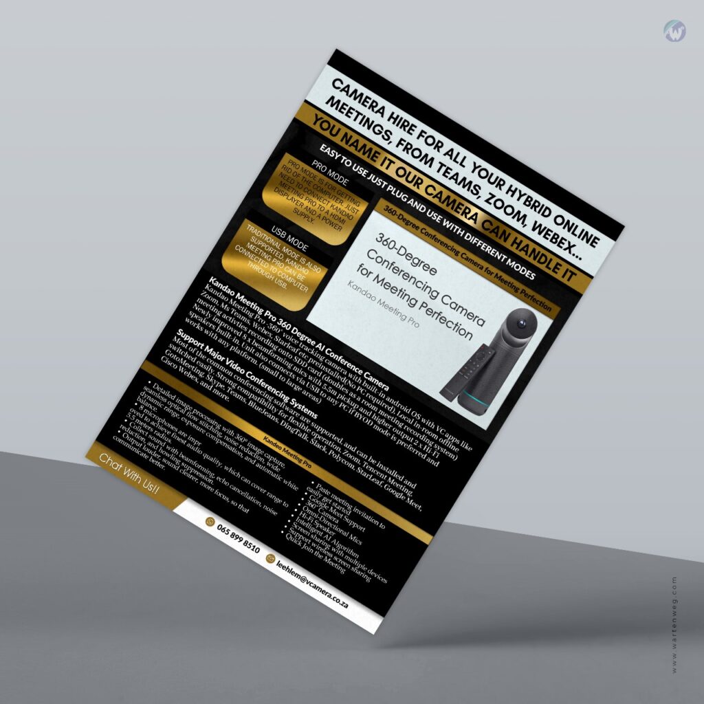
Flyer Design: A Powerful Tool for Effective Communication
Table of Contents
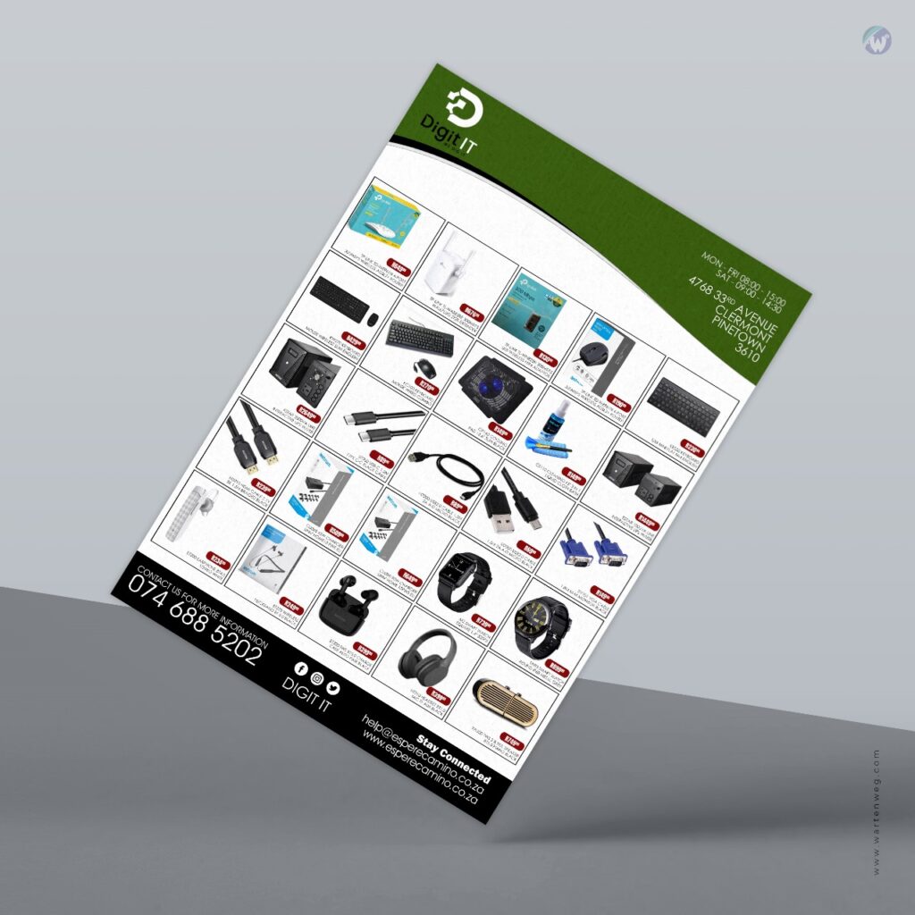
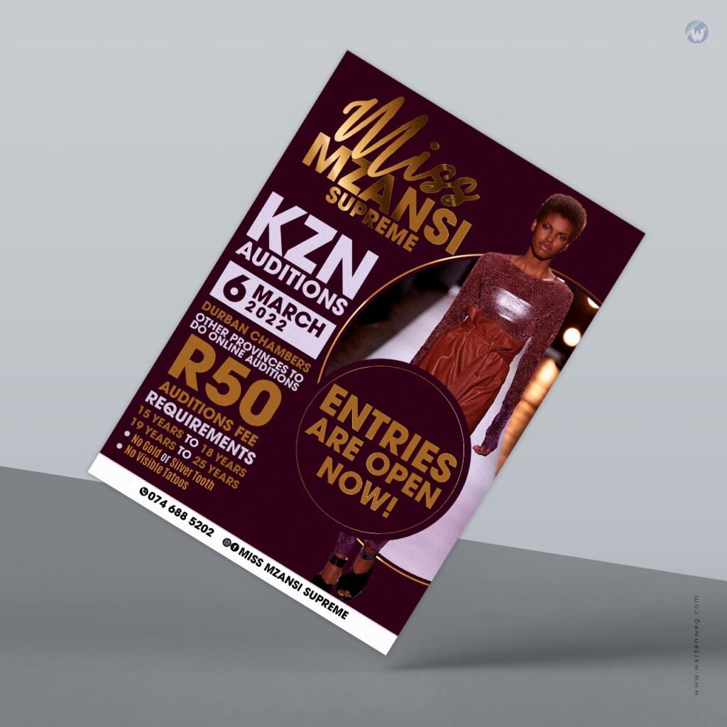
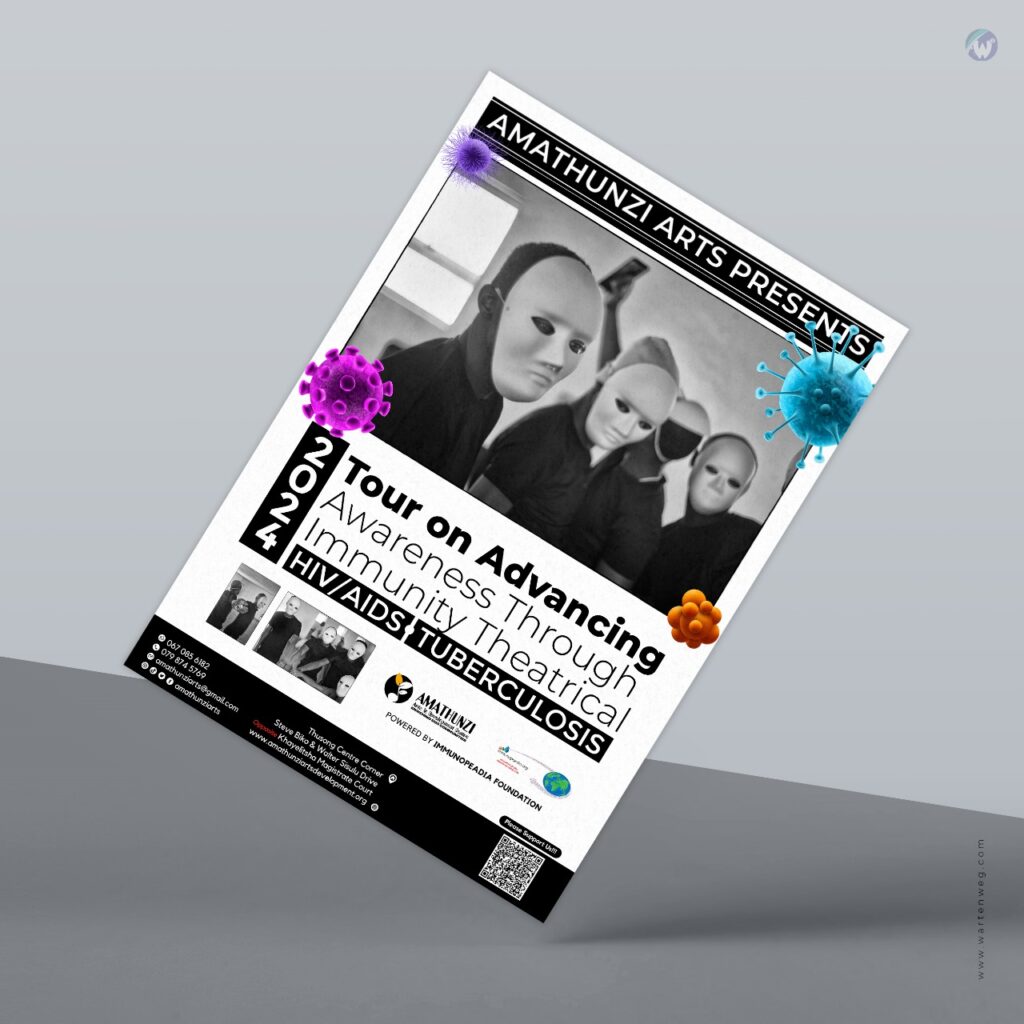
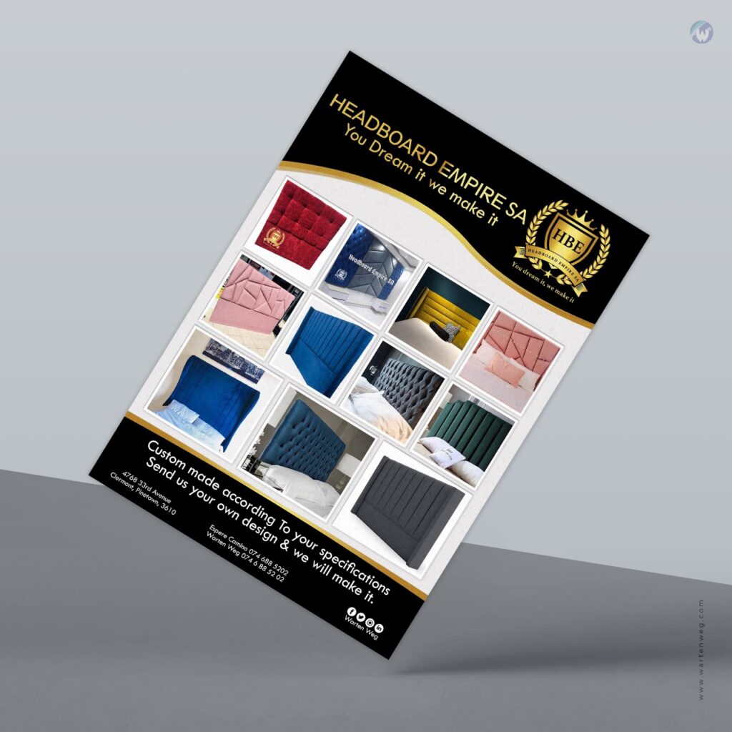
Flyer design is a versatile and dynamic form of graphic design that has been used for decades to convey information, promote events, and advertise products and services.
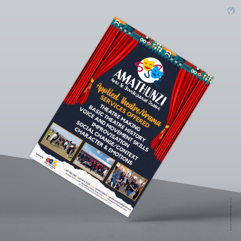
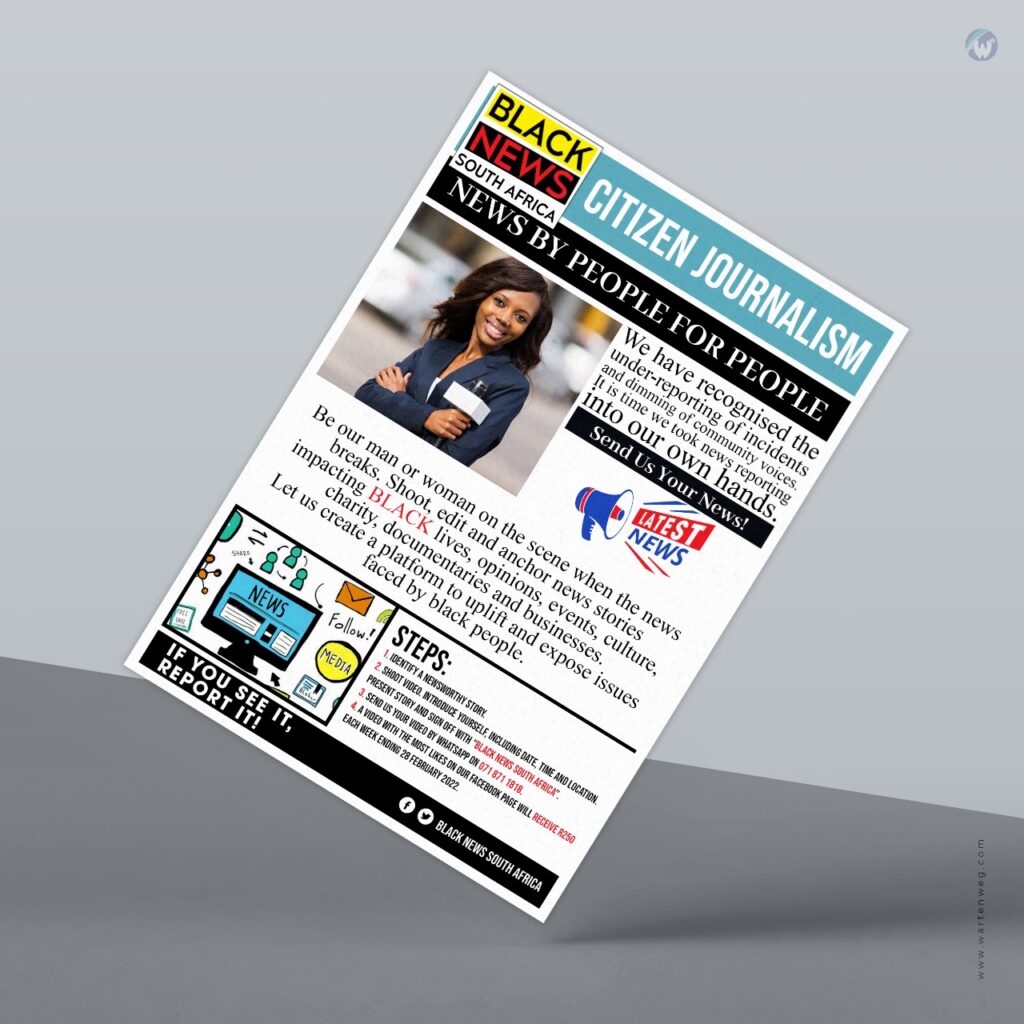
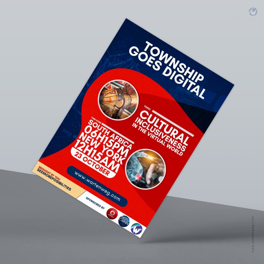
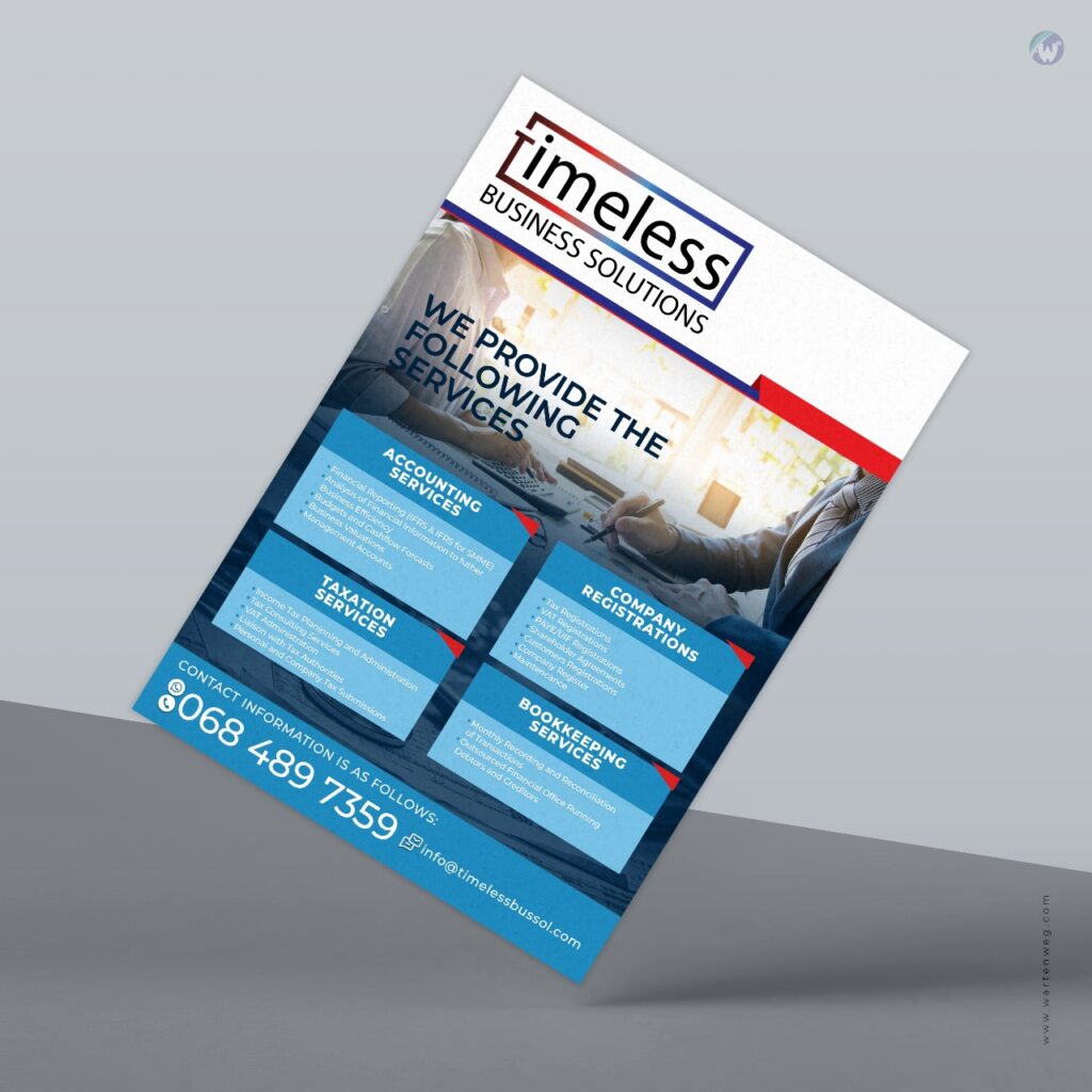
As a freelance graphic designer, I have witnessed firsthand the power of a well-designed flyer in capturing attention, delivering a message, and driving results. I will delve into the art of flyer design, discussing its importance, key elements, and best practices, as well as sharing some tips and tricks to create flyers that truly stand out.
Importance of Flyer Design
Flyers are an essential part of marketing and communication strategies for businesses, organizations, and individuals alike. They serve as a tangible piece of printed communication that can be distributed to a wide audience, making them an effective tool for reaching out to potential customers or spreading awareness about an event or cause.
Flyers can be used for a variety of purposes, including promoting sales and discounts, announcing events, showcasing products or services, providing information about a cause or issue, and more.
One of the key reasons why flyer design is so important is that it allows for targeted marketing. By designing a flyer with a specific audience in mind, businesses and organizations can tailor their message to resonate with that particular group of people. For example, a flyer promoting a rock concert would have a different design and tone compared to a flyer promoting a yoga class. Flyer design allows for customization and personalization, making it a powerful tool for effective communication.
Elements of Flyer Design
A well-designed flyer is not just about aesthetics, but also about functionality and effectiveness. There are several key elements that should be considered when creating a flyer.
Clear and concise message
The message of the flyer should be communicated clearly and concisely. It should be easy for the reader to understand what the flyer is about and what action they need to take, whether it’s attending an event, purchasing a product, or supporting a cause.
Eye-catching visuals
Visuals are a crucial aspect of flyer design, as they are often the first thing that catches the reader’s attention. High-quality images, bold typography, and appealing color schemes can all help make a flyer visually appealing and memorable.
Branding and consistency
If the flyer is for a business or organization, it’s important to maintain consistency with the brand’s visual identity. This includes using the brand’s logo, colors, and fonts to create a cohesive look and feel.
Call to action
A flyer should include a clear call to action, such as “Buy now,” “RSVP,” or “Visit our website.” This tells the reader what they need to do next and encourages them to take action.
Contact information
It’s important to include contact information on the flyer, such as a phone number, email address, or website URL, so that readers can easily get in touch or learn more about the product, service, or event being promoted.
Best Practices for Flyer Design
To create effective flyers, it’s important to follow some best practices that can help make the design process smoother and more successful.
Understand the target audience
Before starting the design process, it’s crucial to understand the target audience and their preferences, needs, and interests. This will help inform the design decisions, such as color scheme, imagery, and tone of voice, to create a flyer that resonates with the intended audience.
Keep it simple
Flyers are meant to be quick and easy to read, so it’s important to keep the design simple and uncluttered. Avoid using too much text or too many visuals that can overwhelm the reader. Instead, focus on the key message and use visuals strategically to support the message.