Design Babysitting Flyer: From Lekker to Legend
Howzit, design fam! Lindani here from Warten Weg. Today we’re going to talk about something that’s become proper hot in our local design scene. We’re design babysitting flyers that make parents say, “Yebo yes!”
Table of Contents
Why Your Design Babysitting Flyer Game Needs to Be Strong
Listen, my friends, here’s the thing about Mzansi—we’ve got more working parents than ever, hey? And what do working parents need? Trustworthy childcare that doesn’t cost an arm and a leg. That’s where a sharp design babysitting flyer comes in. You are helping the gogo next door advertise her daycare. Or you be setting up your own babysitting empire. In either case, your flyer needs to be as fresh as a Gatsby from Cape Town.

Charm your way into new pet-sitting employment! You may customise anything in this PSD file, from the colours to the typefaces, to create a professional flyer that highlights your unique child care services and captures parents’ attention.
ADDITIONAL INFO
- File Format: PSD & JPG
- Easy to use and edit
- Files size: 17MB
Babysitting Service Flyer Template PSD File
As the number of working parents grows, so will the need for high-quality childcare services. This expansion is an opportunity to start or extend marketing for your daycare business.
The Secret Sauce of Successful Flyer Design
Shame, I see so many babysitting flyers that look like they were made during loadshedding—in the dark! Let’s change that today. Here’s what makes a flyer pop harder than a vuvuzela at a soccer match:
Colours That Speak to the Soul
You know what I love about South African design? We’re not afraid of colour, fam! But listen carefully: when you’re designing a babysitting flyer, you need to strike that sweet balance. Think about it: parents want someone responsible, but they also want someone who can bring joy to their kids’ lives.
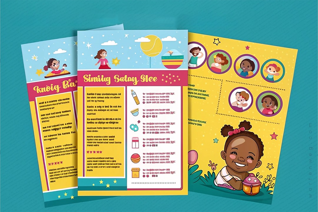
Take our local example from Ntomby & Lindy Sisters (shoutout to the pros!) – they’ve used bright yellow as their main colour with pink accents. It’s cheerful but not chaotic, professional but not boring. That’s what we call ‘sharp sharp’ in the design game!
Layout That Makes Sense
Yoh, nothing makes me more stressed than a flyer that looks like a taxi rank during rush hour—chaos everywhere! Your design babysitting flyer needs to flow smoother than the Jukskei River after heavy rain. Here’s what you need to include:
- Clear pricing structure (like our sisters did with their age-based rates)
- Operating hours (because parents need to know when you’re available, né?)
- Contact details (as clear as a Karoo night sky)
- Location (so people know where to find you)
- Qualifications (like that ECD experience—parents love that!)
Typography That Doesn’t Give People a Headache
My bru, let me tell you something about fonts—they’re like spices in a potjiekos. Too little, and it’s boring; too much, and you’ve ruined the whole thing. When you’re working on how to make a babysitting flyer, stick to two or three fonts max. Use one for your headers. Make it fun but readable. Use another for your body text. Keep it clean. Consider adding one accent font if you’re feeling fancy.
The Tech Talk: Tools of the Trade
Now, I know some of you are thinking, “Eish, Lindani, but I don’t have expensive design software!” No stress, fam. While Photoshop is great for design babysitting flyer projects, there are plenty of free tools out there. Canva is your new best friend—it’s easier to use than explaining directions in Joburg (“Just turn left at the robot…”).
[embedyt] https://www.youtube.com/watch?v=ZafeFHvCR-Q[/embedyt]Making Your Flyer Stand Out
Let’s be honest—the competition out there is tougher than a well-done braai chop. Here’s how to make your babysitting flyer example shine:
Add Some Personal Touch
Include a professional photo (not those Instagram filters, please!) and maybe a little bit about your experience. Parents want to see who’ll be looking after their precious little ones.
Keep It Professional But Friendly
Yes, we South Africans are known for our warmth and ubuntu spirit, but remember—this is still a business document. Balance friendliness and professionalism. Be like a security guard who knows your name but still checks your car boot.
Common Mistakes to Avoid
Ag man, I’ve seen some design disasters that make me want to cry into my rooibos! Here are some things to dodge:
- Overcrowding your design (it’s not a minibus taxi—don’t try to squeeze everything in!)
- Using fonts smaller than my gran’s patience
- Forgetting to proofread (nothing says unprofessional like spelling mistakes, né?)
- Making it look like a party flyer (we’re watching kids, not hosting a groove)
Wrapping It Up
There you have it, my friends. This is everything you need to know about creating a babysitting flyer. It works harder than a Joburg traffic officer at month-end. Remember, your design should be as welcoming as a Sunday braai but as professional as a business meeting.
Whether you’re using a design flyer free template or starting from scratch, follow these tips. You’ll be sorted. And hey, if you’re ever in doubt, just remember: clean design is like a good potjie. It takes time, but the results are worth it!
Keep designing, keep growing, and don’t forget to tag Warten Weg in your creations! Until next time, sala kahle!

Lindani L. Thango is the founder of Warten Weg, a design studio based in Johannesburg. When he’s not creating killer designs, he is arguing about whether pineapple belongs on pizza. He believes it doesn’t. He is also teaching his cat to respond to “Sharp sharp!
FAQs About Design Babysitting Flyer
What size should my babysitting flyer be?
A5 (148 x 210 mm) is your best bet for local distribution. It’s big enough to include all your info. It’s also small enough to be cost-effective when printing. If you’re planning to post your flyer on community boards, choose A4 (210 x 297 mm). This size ensures it catches people’s eyes among all the other posters.
How many copies should I print for my first run?
Start with 50-100 flyers to test how well your design and message resonate with your target audience. You can always print more once you’ve gotten feedback. Maybe make some tweaks to your design based on what parents are responding to.
Should I include my rates on the flyer?
Yes, absolutely include your basic rate structure, as it helps parents quickly decide if your services fit their budget. Keep it simple with just your standard rates. Mention that special arrangements, like public holidays or overnight care, can be discussed personally.
Is it okay to use stock photos instead of personal photos?
Stock photos can look professional. Using real photos of yourself creates more trust with potential clients. Include some happy moments with kids you’ve cared for, with permission. Just make sure your personal photos are high-quality and well-lit, taken against a clean background.
How can I make my flyer stand out from other babysitters?
Focus on highlighting what makes your service unique. This is your teaching background. It also is your first-aid certification or special activities you do with kids. Add a personal touch by including a brief, friendly bio that shows your personality while maintaining professionalism.

