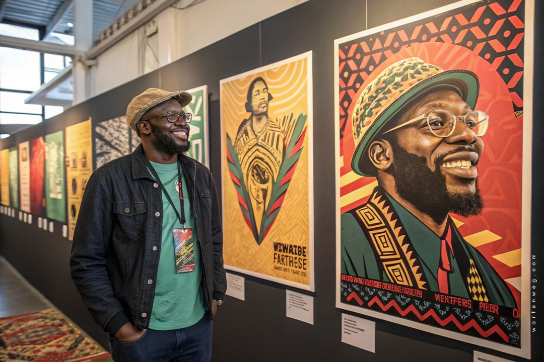
Design A Poster Event in Adobe Photoshop: Lindani’s Creative Hustle from Clermont to Graphic Design Greatness
Yo, what’s good design fam! It’s ya boy Lindani L. Thango dropping some serious graphic design knowledge straight outta Clermont, Durban, zwakala la we design a poster event in Adobe Photoshop.
Table of Contents
The Kasi Creativity Journey
Listen, I started my design journey without knowing how it would evolve. Nobody told me that Design A Poster Event in Adobe Photoshop would become my passion. Growing up in Clermont, I was surrounded by vibrant street art, music posters, and that raw township energy. I knew design was more than just putting stuff on a page. It’s about telling a story, capturing a moment, and making people feel something deep in their bones.
Design ain’t just putting stuff on a page – it’s telling a story, capturing a moment, making people feel something deep in their bones.

From Pinetown Streets to Creative Director
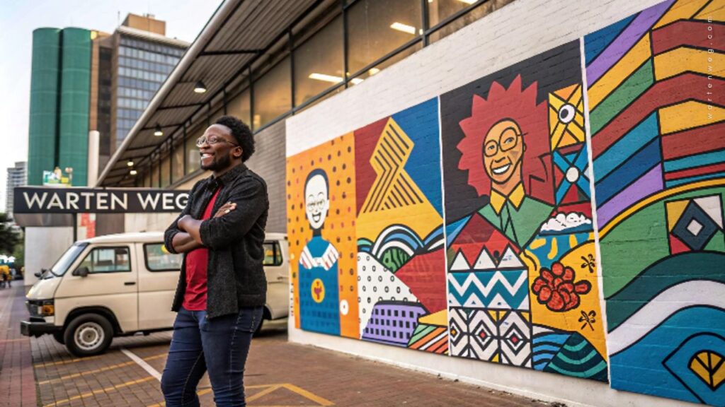
Warten Weg wasn’t just gonna happen overnight. Nah, this was a hustle built on passion, late nights, and mad skills in Adobe Photoshop. Every Design A Poster Event in Adobe Photoshop was like dropping a new track. You gotta make sure it hits different, you know?
Understanding the Importance of Event Posters
Grab your free downloadable poster below and spread the word! Share the excitement by printing it out or posting it online using #EventHashtag.

The Ultimate Event Poster Photoshop Tutorial
Aight, let’s break down how we turn your design game from zero to hero! This event poster Photoshop tutorial is gonna be your new bible for creating posters that make people stop and stare.
1. Document Setup: The Foundation of Fire
When you’re doing a making an event poster in photoshop, first things first—your canvas is everything! Here’s how we roll:
- Open Photoshop (duh!)
- Create a new document.
- Standard sizes we love A4.
- Resolution game strong 300 dpi for print.
2. Background Vibes: Setting the Mood
Your background is like the beat to your design track. You got options:
- Solid Colour: Simple but clean
- Gradient: Add that smooth transition
- Background Image: Bring that extra sauce
3. Typography: Words That Scream
Text ain’t just letters; it’s communication; it’s energy! When you’re in create poster in Adobe Photoshop mode:
- Choose fonts that match your event’s vibe.
- Main title? Go BOLD
- Details? Keep it readable.
- Play with layer styles – drop shadows, gradients, strokes.
Pro Kasi Tip: Dark backgrounds make your text and images pop like fireworks at a township party!
4. Image Magic: Bringing the Visual Heat
Images are your storytellers. In Photoshop poster design tutorials, we teach you to:
- Remove backgrounds like a pro.
- Resize and position with precision.
- Use layer masks to blend seamlessly.
- Add effects that make people go “Wooow!”
5. Layer Styles: The Secret Sauce
Layer styles in Photoshop? That’s where the magic happens!
- Drop shadows for depth
- Inner shadows for drama
- Bevel and emboss for that 3D feel.
- Blending modes to create unique looks
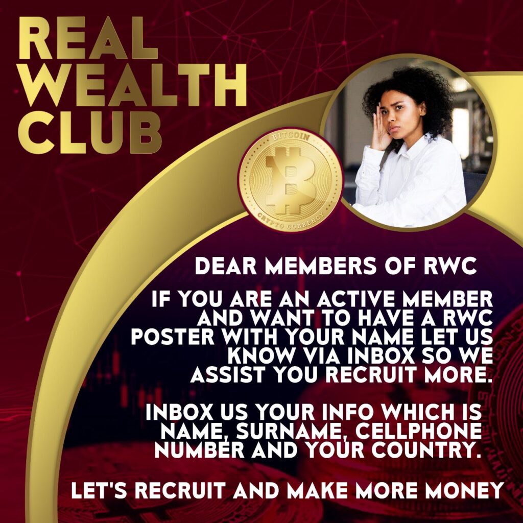
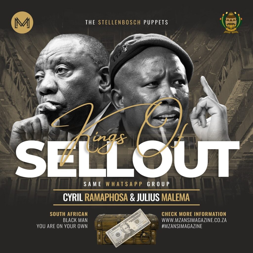
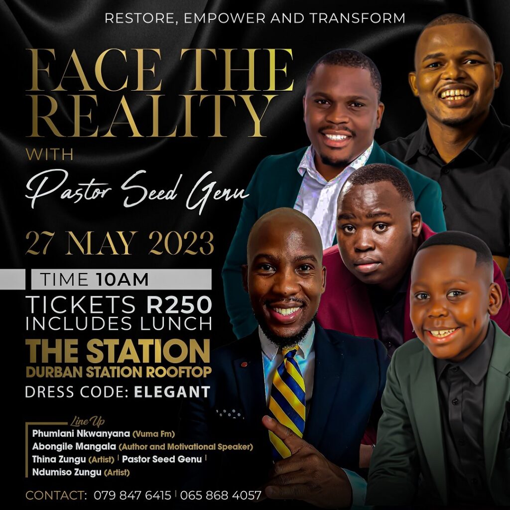
Therefore, a well-designed event poster is essential in achieving the desired outcome. A visually appealing poster.


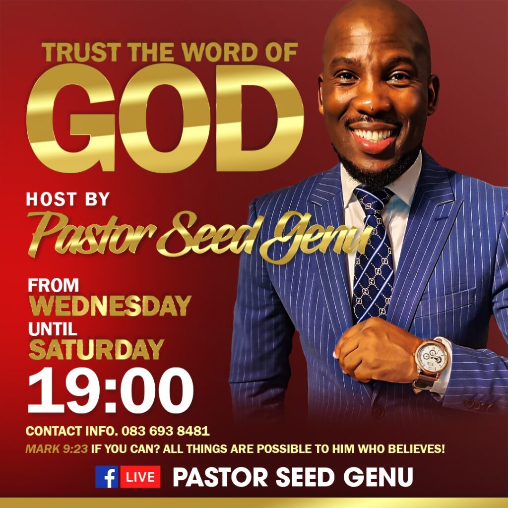
Design Principles: The Unwritten Rules
- Hierarchy: Guide the viewer’s eye like a taxi conductor
- Contrast: Make elements stand out, like a yellow taxi in traffic.
- Balance: Spread your design elements evenly.
- Whitespace: Sometimes less is more, skhokho!
Technical Skills Meet Street Creativity
Design a poster event in Adobe Photoshop isn’t just about technical skills. It’s about understanding your audience, your culture, and your story.
Every poster tells a story. Your job? Make it unforgettable.
Pro Tips from Lindani
- Always save your .PSD file (layer preservation is life!).
- Export high-res for print
- Keep learning, keep experimenting.
Tools of the Trade
Recommended for my design warriors:
- Adobe Photoshop CC
- Graphics tablet
- Inspiration from the streets
- Unlimited creativity
Dos and Don’ts for Design A Poster Event in Adobe Photoshop
| Dos | Don’ts |
|---|---|
| Use high-quality, relevant images with clean backgrounds | Overcrowd the poster with too many unrelated graphics |
| Create a clear visual hierarchy with important information standing out | Use more than 2-3 different font types in a single design |
| Maintain consistent color schemes that reflect the event’s mood | Choose colors that clash or are difficult to read |
| Utilize layer styles to add depth and dimension to your design | Overuse effects that make the poster look cluttered or amateur |
| Save your work in multiple formats (PSD, PDF, JPEG) | Forget to save your original layered Photoshop file |
| Use contrast to make text and graphics pop | Use low-resolution images that appear pixelated |
| Leave adequate white space to improve readability | Fill every inch of the poster with design elements |
| Choose fonts that are legible and appropriate for the event | Use overly decorative or hard-to-read fonts |
| Test your design at different sizes and on different devices | Design only for one specific screen or print size |
| Incorporate brand logos and sponsorship information cleanly | Randomly place logos without considering design balance |
| Proofread all text multiple times | Ignore spelling and grammatical errors |
| Use copyright-free or licensed images | Use random images without proper permissions |
| Create a design that tells a story about the event | Make a poster that looks generic and uninteresting |
| Consider the emotional impact of your color and design choices | Choose colors and designs randomly without purpose |
| Keep the most important event information prominently displayed | Hide critical details like date, time, or location |
Pro Tip: Remember, in Design A Poster Event in Adobe Photoshop, your goal is to create a visually compelling narrative that captures the essence of your event and draws viewers in!
Keywords for the Algorithm Gods
event poster Photoshop tutorial: making an event poster in Photoshop create poster in Adobe Photoshop poster design tutorials
Closing Thoughts
From Clermont to the design world, remember: every poster tells a story. Your job? Make it unforgettable.
Salute!
Lindani L. Thango, Creative Director, Warten Weg
#DesignLife #GraphicDesign #SouthAfricanCreatives
5 FAQs: Design A Poster Event in Adobe Photoshop
What’s the ideal resolution for creating an event poster in Photoshop?
For print materials, use 300 dpi to guarantee crisp, high-quality images that look professional when physically printed. Digital posters for web and social media can be created at 72 dpi. This resolution provides good quality and keeps file sizes manageable.
How do I choose the right font for my event poster design?
Choose fonts that show the mood and theme of your event. Use a bold, attention-grabbing font for the main title. Choose a more readable, clean font for event details. Consider legibility, contrast, and how the typography complements the overall design aesthetic when creating your poster in Adobe Photoshop.
What are the most important design principles when creating an event poster?
The key design principles include establishing a clear visual hierarchy to guide the viewer’s eye. Use contrast to create visual interest. Keep balance in your composition. Always leave some whitespace. This will prevent your design from looking cluttered. Make sure that the most critical information stands out.
How can I make my event poster stand out using Adobe Photoshop?
Experiment with layer styles like drop shadows, gradients, and embossing to add depth and dimension to your text and graphics. Incorporate high-quality images with carefully removed backgrounds. Use striking colour combinations. Make sure your design tells a compelling visual story. Capture the essence of your event.
What file formats should I use when exporting my final event poster design?
For print purposes, export your poster as a high-resolution PDF. This preserves image quality. It also guarantees compatibility with professional printing services. For digital distribution, save a high-quality JPEG or PNG. This ensures the design’s integrity while making it easily shareable on social media and web platforms.

