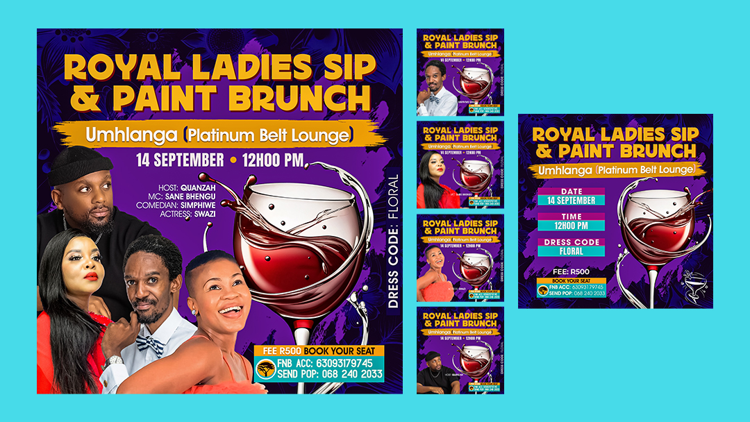
The Ultimate Guide to Creating Lekker Sip and Paint Poster Designs
Sawubona, design fam! I’ve learned a thing or two about creating a Sip and Paint poster design. These posters make people stop scrolling and actually book tickets. I’ve gathered this knowledge in my years running Warten Weg Design Studio here in Clermont. Today, I’m going to spill all the tea (or should I say wine?) about making your paint and sip poster design pop like a champagne cork at a Westville sundowner.
Table of Contents
Why Your Poster Design Matters, For Real Though
Listen, mshana, in this social media age, everyone’s thumb is moving faster than a taxi on South Beach. Your Sip and Paint poster design needs to be sharper than a braai master’s knife. I’ve seen too many amazing events flop. Their posters looked like they were designed during load shedding. It seemed like they were created in the dark, with zero inspiration!
The Secret Sauce to Sip and Paint Event Posters
Let me share what makes a sip and paint event poster proper kiff:
First things first, your colour scheme needs to be as bold as a Umhlanga Rocks sunset. I’m talking about rich purples and deep blues. There’s also that perfect wine red. It makes people think, “Eish, I need to be there!” When I design a paint and sip poster, I start with a dramatic background. This sets the mood faster than a Durban July afterparty.



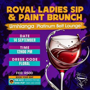
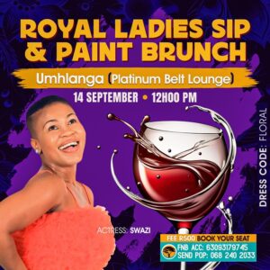

Elements That Make Your Poster Pop
The Must-Haves
- A Title That Slaps Your event name should be bigger than your aunt’s Sunday lunch portions. Make it stand out like a giraffe in Sandton City. The words “Sip and Paint” should be visible from space, I’m telling you!
- The Visuals, My Mshana Add those paint splashes, those wine glasses, but make them look fancy. We’re not designing for your cousin’s house party—this is an upmarket event! Consider those sip and paint picture ideas. They make people feel like they’re about to have the time of their lives.
- The Details That Matter
Include all the important stuff:
- Date and time (clear as Camps Bay water)
- Venue (with proper directions; we’re not trying to send people to Narnia)
- Price (make it look worth it)
- Dress code (because we know Saffas love to dress up!)
Pro Tips from Years in the Game
Let me tell you something about sip and paint image ideas—they need to show both the artistic and social aspects. I always include:
- A beautifully painted canvas
- A sophisticated wine glass
- Happy people (but not too many; we’re not advertising a groove)
- Some artistic elements, like brushes and palettes
The Technical Stuff (Don’t Sleep on This)
When it comes to the actual design process:
- Use high-resolution images (300 DPI lowest, sharp like your mom’s disapproving look).
- Choose fonts that are readable but stylish (no Comic Sans, I beg you!).
- Keep important information away from the edges (printers can be as unreliable as Eskom).
Making Your Event Stand Out
Think about your sip and paint outfit ideas when designing. Will it be a fancy affair? Casual creative? This influences your design choices. I always say your poster should dress for the occasion it’s advertising!
The Social Media Game
Your paint and sip poster design needs to work everywhere:
- Instagram (square format is king)
- Facebook (with space for text)
- WhatsApp (because you know that’s how word spreads in SA)
- Print (because some people still love physical posters, shame)
The Ultimate Sip & Paint Poster Design Guide: Dos and Don’ts
Event Information
| DO | DON’T |
|---|---|
| Display date, time, and venue prominently | Bury essential details in decorative elements |
| Include clear pricing and what’s included | Leave pricing ambiguous or hard to find |
| Add contact details and booking information | Forget social media handles or booking methods |
| Specify dress code and age restrictions | Assume people know the event requirements |
| List any special instructions or materials provided | Leave guests guessing about what to bring |
Branding
| DO | DON’T |
|---|---|
| Maintain consistent branding with your other materials | Mix different brand styles or colors |
| Use your logo appropriately | Make your logo the dominant element |
| Include any partner or sponsor logos as required | Forget to get sponsor logo specifications |
| Keep the design aligned with your target audience | Try to appeal to everyone |
| Use brand colors that complement the event theme | Stick rigidly to brand colors if they don’t work |

Sip and Paint Brunch Poster Design
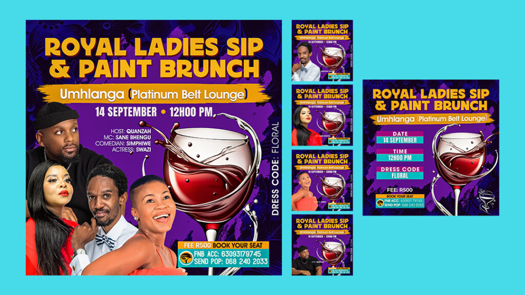
Our Sip and Paint Brunch Poster Design is ideal for bringing a creative element to your next event. This simple design can be customised with your own information in Photoshop. Simply add your information, print, and promote!
Content
| DO | DON’T |
|---|---|
| Proofread all text multiple times | Rush to publish with potential errors |
| Include cancellation or refund policies | Leave out important terms and conditions |
| Specify if food/drinks are included | Assume people know what’s provided |
| List any special guests or instructors | Leave out key attractions |
| Include skill level requirements if any | Assume all attendees are at the same level |
Pro Tip: Always get a second pair of eyes to review your poster before finalising it. Sometimes we get so caught up in the design that we miss obvious things!
Final Thoughts
Creating the perfect Sip and Paint poster design is like making the perfect potjie. It takes time and attention to detail. It also requires that special South African magic. Don’t rush it, don’t skimp on quality, and always remember who you’re designing for.
Quick Checklist Before You Export:
- Is your resolution on point?
- Have you included all contact details?
- Are your colours print-friendly?
- Does it look lekker on mobile?
Remember, your poster isn’t just advertising an event—it’s selling an experience. Make it as vibey as a Sunday braai. Ensure it is as sophisticated as a Stellenbosch wine tasting. It should be as memorable as your first bunny chow in Durban.
Need More Help?
Drop me a message if you need some guidance. As we say in South Africa, “Local is lekker.” I’m always happy to help fellow creatives. I can make their sip and paint events the talk of the town!
FAQs: Sip and Paint Poster Design
What makes a Sip and Paint poster design effective?
A great Sip and Paint poster needs to be visually appealing and informative. Use bright colours, eye-catching fonts, and imagery related to painting and drinks. Clearly display essential information like the date, time, location, and a call to action like a website or phone number.
What are some easy-to-use design tools for creating a Sip and Paint poster?
You don’t need to be a professional designer! User-friendly tools like Canva or Adobe Spark offer pre-made templates and drag-and-drop functionality. For more creative control, try Adobe Photoshop or GIMP.
Where can I find Sip and Paint poster design inspiration and easy guides?
Platforms like Pinterest, Instagram, and Behance are excellent sources of inspiration. Search for “Sip and Paint poster” or “Event Poster Design” for a wealth of ideas. Many free tutorials and guides are available on YouTube and design blogs.
How can I make my Sip and Paint poster design stand out?
Get creative! Use a unique colour scheme, incorporate hand-drawn elements, or experiment with different fonts and layouts. Don’t be afraid to showcase your event’s personality and make it memorable.
What’s the best way to share my Sip and Paint poster once it’s designed?
Share your poster digitally on social media platforms, your website, and event listing websites. Print physical copies to distribute at local businesses, community centres, and art supply stores.
Lindani L. Thango is the founder of Warten Weg Design Studio, specialising in event promotion and branding. When he’s not designing, you can find him at a local art gallery or trying to convince his friends that pineapple doesn’t belong on a pizza.
