Design Summer Olympic Flyer – A Guide for the Woke and Creative
Eish, the design Summer Olympic flyer – that’s like the World Cup for sports, but way bigger, you feel me? It’s a global event that gets the whole world hyped up, from Soweto to Sandton. As a graphic designer, I can’t resist creating a killer flyer. It’ll have the streets talking.
Table of Contents
Now, I know what you’re thinking: “Lindani, ain’t nobody got time for some fancy-schmancy template. We want something that’s straight forward, you feel?” Well, my friend, you’ve come to the right place. Don’t worry about those basic templates. We’re about to show you how to design Summer Olympic flyer. It will have the whole ‘hood hyped.
So, grab your Photoshop, put on your creative cap, and let’s get this party started. Woza, bru!

Laying the Foundation: Building a Dynamic and Distinctive Design
First things first, let’s talk about the basics. You gotta make sure your flyer is the right size, you feel? A4 or US Letter—those are the go-to sizes that work best for printing and distribution. No point in making something that’s gonna look like a postage stamp, right?
Now, the colour palette – that’s where the real magic happens, my guy. You wanna channel the energy of the Olympics, so think vibrant blues, fiery oranges, and that dazzling yellow. But don’t just slap those colours on willy-nilly. Nah, you gotta make it flow, you feel? Play around with dynamic gradients and dope colour combinations to make your flyer stand out like a sore thumb.
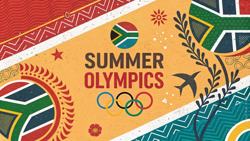
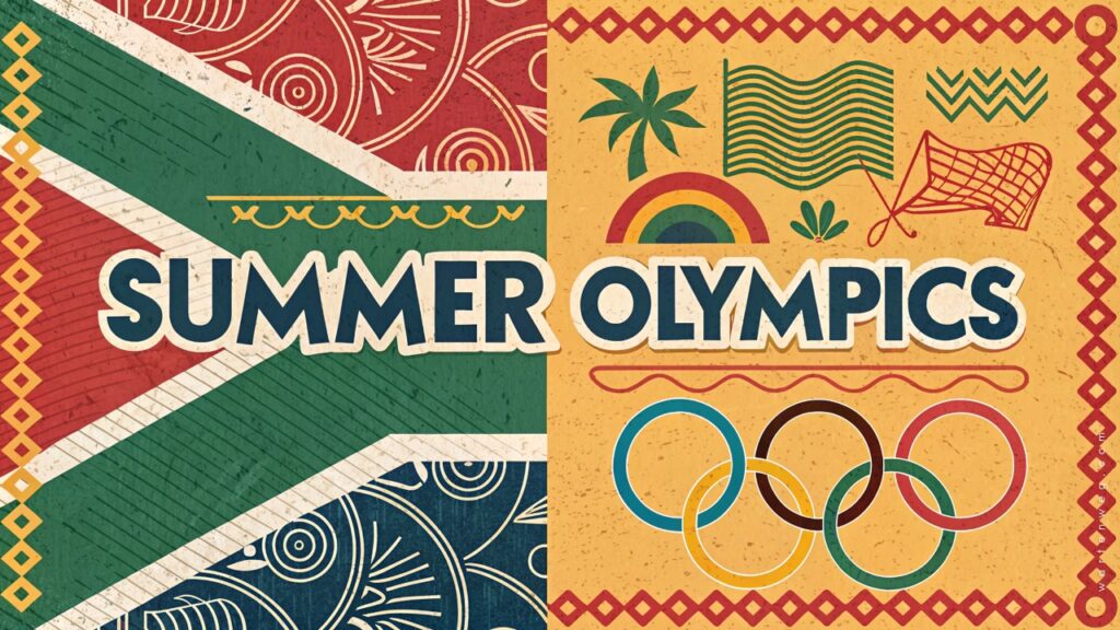
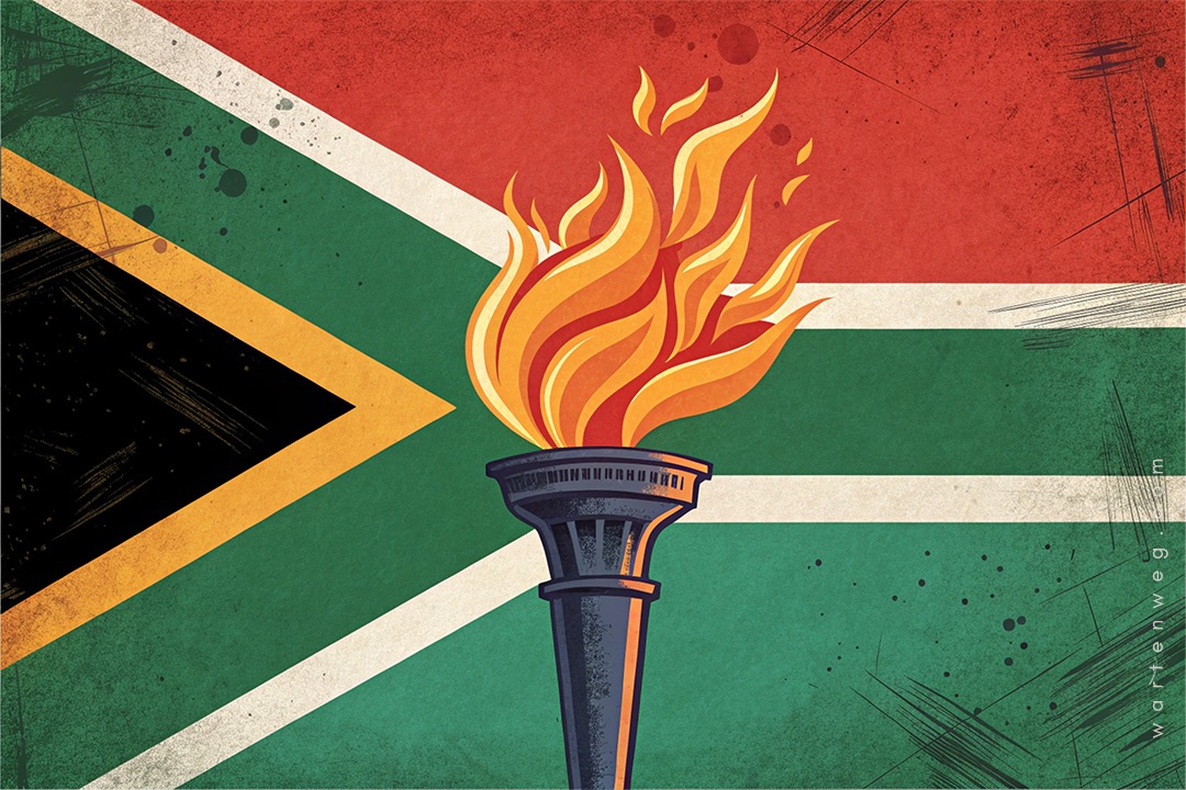
And let’s not forget about those iconic Olympic symbols, hey? The five rings, the torch, the laurel wreath—those are the kinds of visuals that’ll get people hyped. But don’t just use ’em straight up, you know? Get creative and put your own spin on it. Maybe you can make the rings look like they’re exploding or something. Go wild, my bru!
Crafting Captivating Headlines that Command Attention
Aight, now we’re getting to the juicy bits. The headlines—that’s where you really gotta bring the heat, you feel? Forget about generic stuff like “Summer Olympics 2024” or whatever. Nah, we’re going for the gold here.
You gotta choose fonts that are clean, bold, and easy to read, even from a distance. And then, the real magic happens in the wordplay, my guy. Consider keywords that capture the essence of the Olympics. Examples are “Quest for Glory,” “Unleash Your Potential,” and “Celebrating Global Sport.” You get the idea.
[embedyt] https://www.youtube.com/watch?v=VLNbNUg8qDA[/embedyt]But don’t just throw those words on the page and call it a day. Nah, you gotta make that text pop, you know? Use contrasting colours, play with font sizes and weights, and make sure that headline jumps off the page. It’s all about creating a visual feast that’ll have the people screaming, “Yoh, that’s fire!”
Captivating Visual Storytelling: Bringing the Olympics to Life
Alright, now we’re getting to the juicy bits, my bru. The visuals – that’s where you really gotta bring the heat, you feel? You wanna find some dope action shots of the athletes, you know? Capture that intensity, that grace, that raw power. And don’t just plop ’em on the page and call it a day. Nah, you gotta work that Photoshop magic, my guy.
You can play around with filters. Experiment with the contrast. Try going black and white for a moody vibe. And don’t forget about those subtle Olympic symbols, bra. The torch, the laurel wreath, the flame – those little details can really take your flyer to the next level.
But remember, it’s all about balance, you feel? You don’t wanna go overboard and make it look like a mess. Nah, you gotta find that sweet spot where everything comes together in a way that’s just chef’s kiss.
DOs and DON’Ts for design Summer Olympic flyer
| DOs | DON’Ts |
|---|---|
| ✅ Embrace the vibrant Olympic spirit with a bold, harmonious color palette | ❌ Use dull, uninspired colors that fail to capture the energy of the games |
| ✅ Integrate iconic Olympic symbols like the rings, torch, and laurel wreath in creative, artistic interpretations | ❌ Rely on clichéd, unimaginative uses of Olympic imagery |
| ✅ Experiment with dynamic, eye-catching layouts that guide the viewer’s attention | ❌ Settle for a cluttered, disorganized composition that overwhelms the sviewer |
| ✅ Craft compelling, impactful headlines using powerful, evocative language | ❌ Settle for generic, forgettable text that doesn’t ignite excitement |
| ✅ Utilise high-quality, action-packed photography that conveys the thrill of athletic competition | ❌ Use low-resolution, generic stock images that fail to engage the audience |
| ✅ Seamlessly incorporate subtle design elements like subtle textures and geometric patterns | ❌ Overload the flyer with too many competing visual elements |
| ✅ Include clear calls-to-action that inspire the viewer to get involved | ❌ Neglect to provide the audience with a next step or way to engage further |
| ✅ Proofread meticulously to ensure perfect spelling and grammar | ❌ Allow careless typos or grammatical errors to undermine your professionalism |
| ✅ Leverage the power of social media by including relevant hashtags and icons | ❌ Miss the opportunity to amplify your reach and encourage digital sharing |
| ✅ Adhere to best practices for high-resolution, print-ready design | ❌ Produce a flyer that appears pixelated, blurry, or low-quality when printed |
Follow the DOs, and you’ll be well on your way to designing a flyer that’s sure to inspire and captivate your audience.
Putting the Finishing Touches: Polishing Your Masterpiece
Aight, now we’re in the home stretch, my bru. Time to put the final touches on this bad boy and make it look like a million bucks.
First up, the border – you gotta frame that flyer in a way that’s clean and cohesive, you know? Maybe use one of those Olympic colours, or even play around with a subtle gradient. And don’t forget about those social media icons and hashtags, my guy. Gotta make sure the people know where to find you and spread the word, you feel?
And lastly, the call to action – that’s where you really seal the deal, you know? Give the people a clear direction. It can be checking out a website, signing up for an event, or hitting up your socials. You wanna make sure they’re hyped and ready to get involved, you feel?
So, there you have it, fam. Your step-by-step guide to crafting a Summer Olympic flyer that’ll have the whole ‘hood talking. Just remember, the key is to stay true to your style. Channel that kasi energy. Don’t be afraid to get a little wild. You feel?
Now, get out there and make some magic, my bru. The Olympics are coming, and we gotta show the world what the streets of South Africa are made of. Sawubona, and let’s get this party started!

FAQ’s – Design Summer Olympic Flyer
Why is creating your own Summer Olympic flyer better than using templates?
Building your own design from scratch gives you the opportunity for unique creative expression. You have the freedom to customise every aspect. This way, you can capture the true essence of the Summer Olympics. Inspire others with your distinct vision.
What are the essential elements to create a captivating foundation for your flyer?
Embrace the vibrant Olympic spirit with a carefully curated colour palette. Integrate iconic Olympic symbols. Experiment with different artistic interpretations. These steps can help you tell a compelling story that resonates with the theme. Choosing a standard flyer size provides a strong foundation to let your creativity soar and impress your audience.
How can I make headlines that command attention and capture the essence of the Olympics?
Opt for impactful, readable fonts that grab attention at a glance. Create headlines that captivate. Use impactful phrases that evoke the spirit of the Olympics. Consider words like “Quest for Glory,” “Unleash Your Potential,” or “Celebrating Global Sport.” Use contrasting colours to make your text stand out for greatest visual impact.
What is the importance of visual storytelling in designing a Summer Olympic flyer?
Visual storytelling is crucial for capturing the excitement and energy of the Olympics. Use high-quality action shots of athletes. Subtly weave Olympic symbols into the imagery. Experiment with photo filters to enhance the visual appeal. These elements help convey the intensity and grace of the sports while reinforcing the thematic connection.
How can I add the finishing touches to my Summer Olympic flyer for a polished, professional look?
To polish your masterpiece, frame the flyer with a thin border in an Olympic-themed colour for cohesion. Incorporate social media icons and relevant hashtags to encourage online sharing. Conclude with a clear call to action, directing viewers to a website, event details, or your own social media. Follow best practices. Use high-resolution visuals. Prioritise layout harmony. Proofread for accuracy. Explore free design resources for added visual interest.

