Create a Magazine Cover Design: A Jozi-Style Guide to Making Covers That Pop
Yoh, my people! You’re here, which means you’re ready to moer (that’s Jozi slang for “smash”) into the world of magazine cover design. Whether you’re a seasoned designer or a newbie, you want to create a magazine cover design. You are trying to figure out how to do it. You want it to look like more than what your toddler cousin did. You’re in the right place.
We will dive deep into the art of creating a magazine cover design today. It’s a design that’s sharper than a rooibos tea after a long night of jol (partying).
Table of Contents
Grab your biltong. Sit back. Let’s talk about how to design a magazine cover that’ll make people stop scrolling and start staring.
Why Magazine Covers Matter: The First Impression is Everything
Let’s be real, my bru—magazine covers are like Tinder profiles. If your cover doesn’t catch the eye in the first two seconds, it’s getting swiped left. Whether you’re designing for a school project, a client, or your own creative hustle, this is your moment. The cover says, “Hey, I’m worth your time.”
But how do you create a magazine cover design that stands out in a sea of mediocrity? Don’t stress; I’ve got you. We’re going to break it down step by step, from brainstorming magazine cover design ideas to understanding magazine design costs. And don’t worry, I’ll keep it lekker (fun) along the way.
Visual Elements
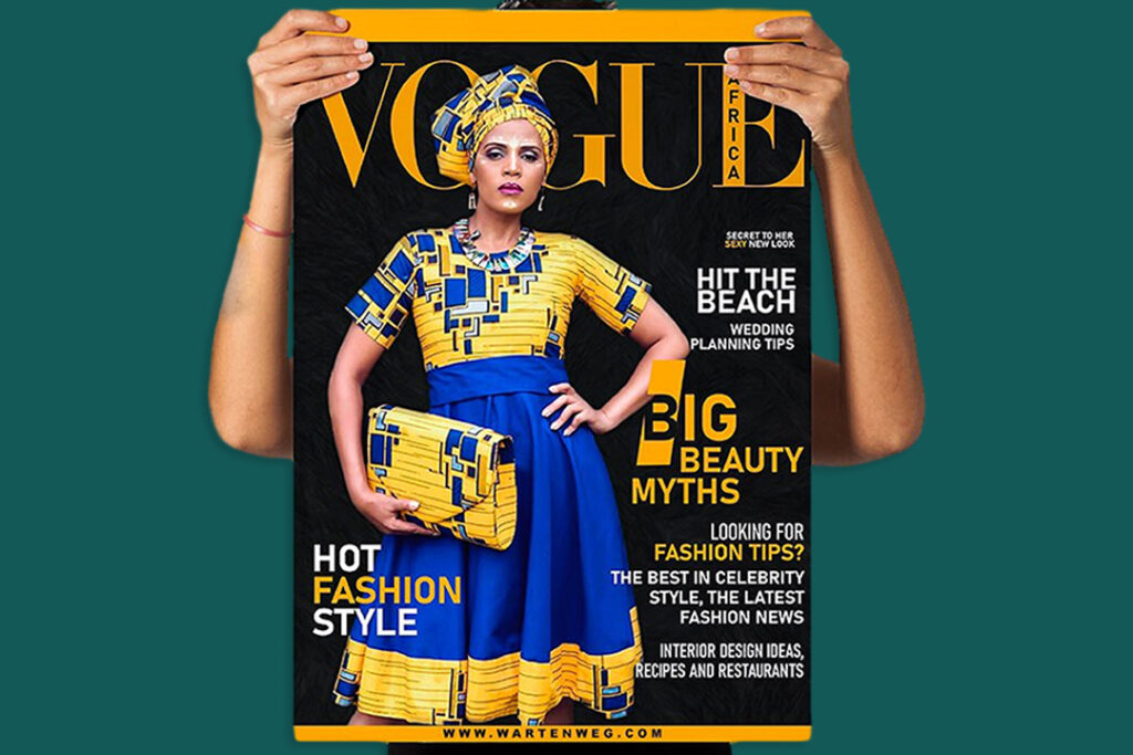
High-quality images are essential. Choose visuals that are relevant to your content and evoke curiosity. The #VogueChallenge showcases the power of strong imagery.
Typography
Typography is a powerful design element. Experiment with different fonts, sizes, and weights. Vogue’s logo is a classic example of impactful typography.
Color & Contrast
Color palettes evoke emotions. Choose colors that align with your theme and create the desired mood. Use contrast to highlight important elements like the title.
Composition & Balance
A balanced layout is key. Distribute elements evenly, considering the visual weight of each part. Magazine covers often follow a classic grid layout.
Branding & Consistency
Incorporate brand elements like logos, colors, and typography to maintain consistency and reinforce brand recognition across platforms.
Headlines & Subheadings
Craft compelling headlines that offer a glimpse into the content. Keep them concise, intriguing, and relevant to the main theme.

Step 1: Understand the Basics of Magazine Cover Design
Before you even open Photoshop or InDesign, you need to understand the fundamentals. A magazine cover isn’t just a pretty picture—it’s a strategic piece of art that communicates the essence of your content.
What is a common design strategy used to create a magazine cover?
Glad you asked, my friend. A common design strategy used to create a magazine cover is the hierarchy of information. This means arranging elements in order of importance. Here’s how it works:
- The Masthead: This is the name of the magazine, usually at the top. Think of it as your brand’s ekasi (neighborhood)—it’s where you live.
- The Main Image: This is the star of the show. It is a person, an object, or a bold graphic.
- The Cover Lines: These are the headlines that tease the content inside. Keep them short and spicy, like a chakalaka (spicy relish).
- The Barcode and Date: Don’t forget these, unless you want your magazine to look like it’s from 1994.
Pro tip: If you’re using InDesign to create a magazine cover, make sure your layers are organised. Nothing is worse than trying to find a tiny text box in a sea of chaos.
Step 2: Brainstorm Magazine Cover Design Ideas
Now that you know the basics, it’s time to get creative. But where do you start? Here are some magazine cover design ideas to get your juices flowing:
- Bold Typography: Sometimes, less is more. A striking font can speak louder than any image.
- Minimalist Vibes: Clean, simple designs can be just as impactful as busy ones.
- Play with Colours: Use a colour palette that pops but doesn’t blind your audience. Think sunset over Soweto vibes.
- Incorporate Cultural Elements: If you’re designing for a South African audience, throw in some local flavor. Maybe a shweshwe pattern or a silhouette of Table Mountain.
If you’re stuck, there are tools like free fake magazine cover generators to help you. You can also use magazines to determine the visual weight of each part. Make sure the cover isn’t cluttered and that the information is easily digestible. Magazine covers, like those seen in the #VogueChallenge, often follow a classic grid layout. This creates a sense of order. It also adds sophistication.

Step 3: How to Design a Magazine Cover That Pops
Alright, let’s get into the nitty-gritty. Here’s how to design a magazine cover that’ll make people go, “Yoh, this is fire!”
1. Choose the Right Image
Your main image is the heart of your design. Whether it’s a photo, illustration, or graphic, it needs to be high-quality and relevant. If you’re creating a magazine cover for a school project, make sure it’s something that shows your theme.
2. Play with Layouts
Don’t be afraid to experiment with different layouts. Try placing your masthead at the bottom or overlapping your image with text. Just make sure it’s still readable. No one wants to squint like they’re trying to read a street sign in Joburg traffic.
3. Use Contrast Wisely
Contrast is your best friend. Dark text on a light background, or vice versa, will make your cover stand out. But don’t go overboard—you’re designing a magazine cover, not a neon sign in Times Square.
4. Keep It Balanced
Balance is key. If your image is on the left, balance it with text on the right. Think of it like a braai (barbecue)—you need the right mix of meat, salads, and pap to make it perfect.
Step 4: How to Create a Magazine Cover on a Budget
Now, let’s talk about the elephant in the room: magazine design cost. If you’re working with a tight budget, don’t worry. You can still create a magazine cover design that looks professional. It won’t break the bank.
1. Use Free Tools
There are plenty of free tools out there to help you create a magazine cover design online. Websites like Canva or Adobe Spark offer templates and easy-to-use interfaces.
2. DIY Photography
If you can’t afford a professional photographer, grab your phone and start snapping. With the right lighting and editing, you can create a cover-worthy image.
3. Collaborate with Local Talent
Reach out to local artists or designers who are willing to collaborate. You’d be surprised how many people are keen to build their portfolios.
[embedyt] https://www.youtube.com/watch?v=YQBunR_nEsc[/embedyt]Step 5: Test and Refine Your Design
Once you’ve created your magazine cover, it’s time to test it. Show it to friends, family, or even strangers on the street (just don’t be creepy about it). Ask for honest feedback and be open to making changes.
Remember, design is a process. Even the pros don’t get it right the first time. Don’t be discouraged by your first draft. It can look like a drunken springbok designed it. No offence to springboks.
Bonus Tips for Creating a Magazine Cover Design
- Stay Consistent: If you’re designing a series of covers, keep the style consistent. This builds brand recognition.
- Think Outside the Box: Don’t be afraid to break the rules. Sometimes, the most memorable designs are the ones that dare to be different.
- Have Fun: Design should be enjoyable. If you’re not having fun, you’re doing it wrong.
Final Thoughts: Create a Magazine Cover Design That Tells a Story
At the end of the day, a magazine cover is more than just a pretty picture—it’s a story. Whether you’re designing for a school project, a client, or your own creative vision, your cover should inform people. It should tell them what to expect inside.
So, go forth and create a magazine cover design that’s as bold, vibrant, and unique as South Africa itself. And if you ever feel stuck, just remember: even the best designers started somewhere.
Until next time, keep it elegant (cool), my people.

FAQ’s: Create a Magazine Cover Design
What is the ideal resolution for a magazine cover design?
For print magazine covers, use 300 DPI (dots per inch) in CMYK colour mode to guarantee crisp, professional-quality results.
How do I make sure my text is readable over images?
Add a subtle shadow or a semi-transparent overlay. Place text strategically in areas with less busy backgrounds. This guarantees your text remains legible against any image.
You should use no more than three fonts on your magazine cover?
Use a limit of two or three complementary fonts. This will keep readability and a professional appearance. Choose one dominant show font for the masthead. Use a clean font for supporting text.
What size should my magazine cover be?
Standard magazine sizes are typically 8.5″ x 11″ for US Letter. For A4, sizes are 210mm x 297mm. Always check with your printer for their specific requirements.
Can I use free stock photos for my magazine cover?
Yes, you can use free stock photos from reputable sites like Unsplash or Pexels. Make sure to verify the usage rights. Consider purchasing premium images for commercial projects.

