
Simple Poster Advertisement in Photoshop: Templates, Ideas & Examples
Simple Poster Advertisement in Photoshop: Templates, Ideas & Examples
Howzit, my creative family! Lindani L. Thango here from Warten Weg, coming at you straight from the vibrant streets of Pinetown. Today, we’re diving deep into creating a simple poster advertisement in Photoshop that’ll make your peers go, “Eish, that’s proper!”
The Basics: Why We’re Here
Listen, my friends. You are a student looking for simple poster advertisement examples. You can also be a business owner wanting to create something lekker for your brand. I’ve got you covered. After years of designing everything from simple advertisement poster templates to wild marketing campaigns, I had Sandton talking. I’m here to share the sauce.
First things first, why Photoshop? Well, my friend, Photoshop is like the braai master of design tools—it can handle anything you throw at it. You are creating a simple advertisement poster for a school project. You might also be designing a simple job advertisement poster. Photoshop lets you experiment. You can tweak and perfect your design.
And let’s be real, in today’s fast-paced world, nobody’s got time for complicated designs. A simple poster advertisement is like a good boerewors roll—straightforward, satisfying, and leaves everyone happy.
Let’s Keep It Real
Before we jump in, let me tell you something: I’ve seen too many people trying to make things complicated. Shame, they end up with designs that look like they’ve been through a taxi rank during rush hour. We don’t want that! A simple poster advertisement in Photoshop should be as smooth as a Sunday afternoon braai.
Getting Started: Your Canvas Setup
First things first, fam. Fire up Photoshop like you’re lighting the braai—with purpose! Here’s what you need:
- Choose your size (A3 or A4 is perfect for a simple advertisement poster for a school project).
- Set resolution to 300 DPI (Don’t be shy—quality matters!)
- Colour mode: CMYK (Trust me, printing houses will thank you.)
Pro Tip: Size Matters, Bru!
For those working on simple poster advertisement examples for students, remember this: bigger isn’t always better. Sometimes a simple advertisement poster drawing can speak louder than a massive billboard. It’s not about the size; it’s about the impact!
The Design Process: Making Magic Happen
Now, let me share something that’ll make your simple poster advertisement in Photoshop pop harder than a bottle of champagne at a year-end event:
Layout is Everything
When creating a simple advertisement poster design, think of it like organising your spaza shop:
- Headlines at eye level (like the good stuff on the shelf)
- Supporting text below (like the price tags)
- Images that grab attention (like that sweet display at the entrance)
Colour Choices That Slap
Yo, listen carefully—your colour choices should be as intentional as picking a braai spot at the park. Whether you’re creating a simple product advertisement poster or a simple job advertisement poster, colours tell your story.
- Use your brand colours (if you have them).
- Stick to 2-3 main colours (like a good pap and wors combo).
- Make sure there’s proper contrast (dark on light, light on dark).
Typography: Don’t Make Me Cringe!
Fam, I’ve seen some simple advertisement poster ideas that made me want to cry into my Castle Lite. Let’s talk fonts:
- Headlines: Bold and beautiful (like your mama’s Sunday best)
- Body text: Clean and readable (like a good road sign)
- Spacing: Give your letters room to breathe (no one likes a cramped kombi)
For The Students Out There
If you’re working on simple advertisement poster examples for students, here’s a tip. Start with simple advertisement poster drawing with pencil. Yes, I know we’re talking Photoshop. Planning on paper first is like having a good map before a road trip.
Adding That Extra Sauce
Now, for those looking to level up their simple advertisement poster template game:
- Use subtle gradients (like a Jozi sunset).
- Add texture (but keep it light, like morning mist).
- Include your contact details (make it easy for people to find you; don’t play hide and seek!).
Special Mention: Simple Food Advertisement Poster Drawing
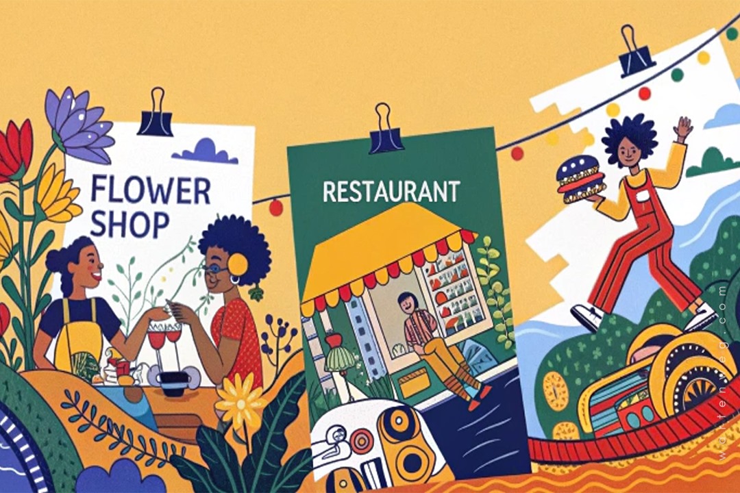
For my food industry fam—your images should look so good. They should make people hungry even after a full pap and vleis! Whether it’s a simple flower shop advertisement poster or a restaurant menu, make those visuals mouthwatering.
Common Mistakes to Avoid
Let me tell you about some fails I’ve seen (names protected to avoid drama):
- Overcrowding (your poster isn’t a taxi)
- Tiny text (we’re not all blessed with eagle eyes)
- Poor contrast (this isn’t a game of hide and seek)
- Bad image quality (pixelation is not a design style, my friend)
Advanced Tips for the Brave
Let’s circle back to students because, let’s be honest, y’all need all the help you can get. Here are some simple poster advertisement examples for students to inspire your next project:
- School Event Poster: Use your school colours and keep the text short and sweet. Something like “Sports Day: Be There or Be Square!” works perfectly.
- Environmental Awareness Poster: Use earthy tones and images of nature. A simple message like “Save the Planet—It’s the Only One We’ve Got!” can be powerful.
- Book Fair Poster: Use images of books and a catchy slogan like “Get Lost in a Good Book!”
Final Thoughts and Resources
Remember, whether you’re creating a simple mehndi advertisement poster or a corporate event announcement, the principles stay the same. Keep it clean, keep it clear, and most importantly, keep it lekker!
Free Resources I Love:
- Font websites (because good typography shouldn’t cost an arm and a leg)
- Stock photo sites (for when you can’t take your own pics)
- Colour palette generators (because sometimes we need inspiration)
Wrapping It Up
There you have it, my creative family! Here is everything you need to know. Create a killer, simple poster advertisement. It’ll make heads turn faster than a taxi changing lanes. Remember, practice makes perfect, and every designer started somewhere.
Keep designing, keep creating, and most importantly, keep it real! And hey, if you’re ever in KZN, come through to Warten Weg—first cup of coffee’s on me!
Until next time, sharp sharp!
Lindani L. Thango Founder, Warten Weg Design Studio Clermont, South Africa
P.S. Drop a comment below if you want to see more tutorials like this one. And don’t forget to share your creations—nothing makes me happier than seeing what you beautiful people come up with!
FAQs: Simple Poster Advertisement in Photoshop
What makes a good simple poster advertisement?
A good simple poster advertisement is clear, concise, and visually appealing. It should have a strong focal point, minimal text, and a call to action. Think of it like a good tweet—short, sweet, and to the point. Use bold colours, high-quality images, and easy-to-read fonts to grab attention.
Can I create a simple poster advertisement in Photoshop if I’m a beginner?
Absolutely, my bru! Photoshop looks intimidating at first. Once you get the hang of it, it’s as easy as making a cup of tea. Start with a simple poster advertisement template to get the basics down. Watch a few tutorials. You can also check out Warten Weg’s YouTube channel. Practice with simple designs like a simple advertisement poster for a school project. You’ll be a pro in no time!
Where can I find simple poster advertisement examples for inspiration?
You can find simple poster advertisement examples all over the internet. Pinterest, Behance, and even Google Images are great places to start. Look for designs that match your project. It is a simple flower shop advertisement poster or a simple job advertisement poster. Just remember, inspiration is cool, but copying is not kosher. Make it your own, my friend.
How do I choose the right colours for my simple poster advertisement?
Colour choice depends on your message and audience. For a simple advertisement poster for kids, go bright and bold. For a simple job advertisement poster, stick to professional tones like blue, grey, or black. Use tools like Adobe Colour to create harmonious colour palettes. And remember, contrast is key—make sure your text stands out against the background.
Can I use Photoshop to create a simple advertisement poster in Zulu or other languages?
For sure! Photoshop supports multiple languages, so you can easily create a simple advertisement poster in Zulu or any other language. Just make sure your fonts support the characters, and double-check for spelling mistakes. You can create a traditional advertisement poster simple or a simple food advertisement poster drawing. The process is the same, but with a different language twist.